What Is DTP A Guide to Mastering Desktop Publishing

Ever wonder how a simple text document transforms into a glossy magazine, a perfectly formatted user manual, or a stunning company brochure? That's the magic of desktop publishing, or DTP for short.
It’s the craft of using specialized software to arrange text and images on a page, creating professional, print-ready documents that look and feel just right.
Understanding DTP and How It Works

Think of it this way: a program like Microsoft Word is fantastic for writing the words, but DTP software gives you complete command over how those words look on the page. It's the bridge that connects raw content to a polished, professional final product. You become the digital layout artist, meticulously placing every headline, image, and paragraph to guide the reader's eye.
This level of control is about more than just aesthetics; it's about effective communication. A great layout can make complex information easy to digest, draw attention to the most important points, and create a specific mood. The end goal is a document that isn't just nice to look at, but is also clear, readable, and delivers its message with impact.
The Three Pillars of Desktop Publishing
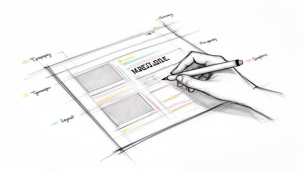
At its heart, all desktop publishing is built on three core pillars. Mastering these is key to creating any professional-grade document, from a simple flyer to a multi-page book.
We can break these down to see how they work together.
The Three Pillars of Desktop Publishing
| Pillar | What It Involves | Its Impact on Your Document |
|---|---|---|
| Page Layout | Arranging all the visual elements—text, images, and even the empty "white space" around them. | Creates a clear structure that makes the document easy to follow and prevents reader fatigue. A good layout feels intuitive. |
| Typography | Choosing fonts, setting sizes, and adjusting the spacing between letters and lines to make text readable and appealing. | Good typography ensures your message is legible and sets the tone. It can make a document feel modern, classic, or playful. |
| Graphics and Images | Integrating visuals like photos, illustrations, charts, and logos to support the text and capture attention. | High-quality visuals can explain complex ideas instantly and make the content far more engaging than text alone. |
When these three elements are in harmony, you move beyond just editing text and start engaging in true visual communication.
Desktop publishing is where artistic principles meet technical precision. It’s the process that ensures what you create on your screen is exactly what comes out of the printer or appears in a digital file, with no loss of quality.
Ultimately, DTP gives you the power to manage every single detail—from the exact placement of a logo in a corporate report to how text elegantly wraps around an image in a newsletter. It’s what guarantees your final document looks exactly as you envisioned it.
The Journey from Manual Paste-Up to Digital Design

To really get why desktop publishing was such a game-changer, you have to rewind the clock a bit. Before DTP, creating any kind of professional publication was a specialized, hands-on, and incredibly expensive craft. It was the exclusive domain of big publishing houses with teams of experts.
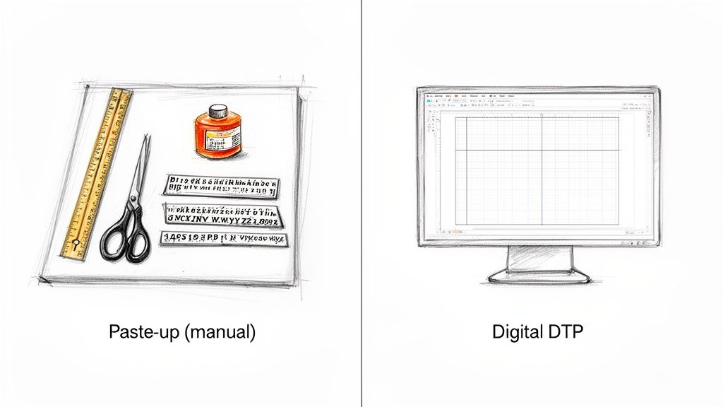
Think about a designer’s toolkit back then. No mouse, no screen. Instead, they had X-Acto knives for trimming text columns, T-squares for making sure everything was perfectly aligned, and messy rubber cement or hot wax to stick every single element onto a big board called a "paste-up." One slip-up—a crooked headline or a misplaced photo—meant carefully peeling things off and starting again. It was painstaking work.
The Dawn of Digital Publishing
Then, the mid-1980s happened, and everything changed. The perfect storm was brewing: personal computers, like the Apple Macintosh, were becoming more common, and laser printers gave people the ability to produce high-quality prints. The last piece of the puzzle clicked into place in 1985 with a program from Aldus Corporation called PageMaker.
PageMaker introduced a concept that we take for granted today: WYSIWYG (What You See Is What You Get). For the first time, you could see a perfect digital representation of your page right on the screen as you worked. This was a massive leap.
For the first time, one person could write the text, arrange the layout, add images, and print a camera-ready document—all from their desk. This new "desktop publishing" workflow turned a complex, multi-person process into a single, manageable job, completely opening up the industry.
The Impact of the DTP Revolution
The effect was immediate and profound. Suddenly, small businesses could design their own slick newsletters and marketing brochures without shelling out for a design firm. Authors could format their own books, and nonprofits could produce polished annual reports entirely in-house.
This newfound accessibility blew the doors off the old way of doing things.
- Reduced Costs: It dramatically slashed the high costs of traditional typesetting and page layout services.
- Faster Turnarounds: Design cycles that used to take weeks could now be done in a matter of days, sometimes even hours.
- Creative Control: Power shifted from the technicians directly to the creators themselves, giving them full control over the final look.
This is the bedrock of modern DTP—the move from glue and blades to pixels and clicks. It transformed publishing from a gated industrial process into an accessible communication tool, empowering millions to bring their ideas to life visually. What once demanded a workshop full of specialists now just needs a computer and the right software.
Mastering the Core Elements of Effective Design

Knowing how to operate desktop publishing software is just the first step. The real magic happens when you understand the principles of effective design—that’s what separates a cluttered, amateur-looking document from a professional one.
Think of it like being a chef. You can own the sharpest knives and the most expensive oven, but without a deep understanding of flavor, texture, and timing, you're just heating up ingredients. In the same way, great DTP isn't about the software; it's about the craft of visual communication. Let's break down the essential ingredients.
The Blueprint: Page Layout and White Space
Every well-designed document starts with a solid page layout. This is simply the art of arranging all your text, images, and other elements on the page. Professionals lean on a grid system, an invisible framework of columns and guides that keeps everything aligned and consistent.
This underlying structure brings a sense of order and makes the content easy to follow. A huge part of this is white space—the empty areas around your content. It’s not "wasted" space at all. In fact, it's an active design element that gives your text and images room to breathe, reduces clutter, and guides the reader's eye to the most important parts.
A well-planned layout with plenty of white space is like a tour guide for your reader. It shows them where to look first, what's most important, and keeps them from getting lost in a wall of text.
The Voice: Typography Choices
Typography is so much more than just picking a font you happen to like. It's about giving your document a voice. The typefaces you choose directly influence readability and set the entire tone of your message.
Here’s what to keep in mind:
- Readability: Serif fonts (like Times New Roman) have little "feet" on the letters, which helps guide the eye along lines of text, making them great for long paragraphs. On the other hand, clean, modern sans-serif fonts (like Arial) are perfect for grabbing attention in headlines.
- Tone: Think about the personality. A bold, blocky font can feel strong and urgent—ideal for a sales poster. A flowing, script-like font might suggest elegance, making it a better fit for a formal invitation.
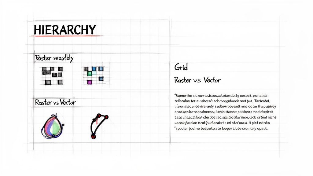
- Hierarchy: You can create a clear visual hierarchy by using different font sizes, weights (like bold or italic), and styles. This system immediately tells the reader, "This is the main headline, this is a sub-header, and this is the main story."
The Visuals: Raster vs. Vector Graphics
Finally, let’s talk about images. If you're doing any kind of DTP work, you absolutely need to know the difference between the two main types of digital graphics, especially when you’re sending files to a printer.
- Raster Graphics: These images, like JPEGs and PNGs, are built from a grid of tiny dots called pixels. They are the go-to for photographs and detailed digital art. The catch? If you try to make a raster image bigger, it gets blurry and "pixelated" because you're just stretching out the same fixed number of dots.
- Vector Graphics: Instead of pixels, vector graphics (like SVGs or AI files) are made from mathematical equations that define points, lines, and curves. Because of this, they are infinitely scalable. You can stretch a vector logo from the size of a postage stamp to a giant billboard, and it will remain perfectly sharp and clear. This makes them the standard for logos, icons, and illustrations.
By thoughtfully combining these core elements—layout, typography, and imagery—you can create documents that not only look great but also communicate with clarity and purpose. To see these concepts in action, you can explore detailed design principles for various print materials.
4. Choosing the Right Desktop Publishing Software
Picking the right DTP software isn't about finding the "best" tool—it's about finding the right tool for your project. A professional designer laying out a 200-page catalog has vastly different needs than a small business owner whipping up a quick social media graphic. Think of it like a toolbox: you wouldn't use a sledgehammer to hang a picture frame.
For the heavy-lifting, professional-grade work, Adobe InDesign is the undisputed industry standard. It’s the powerhouse behind everything from glossy magazines and complex books to interactive digital documents. Its real strength is the granular control it gives you over typography and multi-page layouts, plus it plays nicely with other Adobe tools like Photoshop and Illustrator.
Finding the Right Fit for Your Needs
But let's be honest, not every job requires that kind of muscle. For simpler, everyday tasks, other tools are often a much better, and less intimidating, fit.
Microsoft Publisher: If you're already living in the Microsoft 365 world, Publisher is a great choice for internal business documents. Think newsletters, simple brochures, and event flyers. Its interface feels familiar and accessible, making it easy to get started.
Canva: This web-based platform has taken the design world by storm, and for good reason. Canva is perfect for creating digital content—social media posts, presentations, and basic marketing materials—in minutes. Its massive template library and simple drag-and-drop editor make design feel easy.
The best DTP software is the one that actually fits the job. Trying to design a quick Instagram post in InDesign is like using a bazooka to hunt a rabbit, while laying out a novel in Canva will only lead to frustration. Always match the tool to the task.
To help you decide, here's a quick breakdown of some of the most popular DTP tools and what they're best used for.
A Practical Comparison of DTP Software
| Software | Best For | User Level | Key Feature |
|---|---|---|---|
| Adobe InDesign | Professional print & digital publishing (books, magazines, interactive PDFs) | Professional | Unmatched control over typography and multi-page layouts |
| Microsoft Publisher | Internal business documents (newsletters, flyers, simple brochures) | Beginner | Familiar interface for Microsoft Office users |
| Canva | Quick digital content (social media graphics, presentations, posters) | Beginner | Massive template library and intuitive drag-and-drop editor |
| Scribus | Open-source, professional-level page layout for all operating systems | Intermediate | Powerful, free alternative to InDesign |
Each of these tools has its place. The key is to understand your own project's scope and complexity before you commit.
Thinking Globally: DTP and Translation
Things get even more interesting when your documents need to speak more than one language. This is where your DTP software choice bumps up against the world of translation.
The global machine translation market hit USD 1.1 billion in 2022 and is still climbing. Why? Because businesses everywhere need to get their content in front of international audiences, fast. This often requires specialized document translation software that can work directly with the files your DTP application produces.
With the market for translation management software expected to grow by USD 1.58 billion by 2025, the trend is clear: businesses are looking for smarter, more automated ways to handle these projects. You can dive deeper into these trends with these translation statistics from Redokun.com.
The goal is to find a workflow that lets you create beautiful designs and get them translated for a global audience—without the formatting falling apart in the process.
Navigating the Challenges of Multilingual DTP
When you need to reach a global audience, desktop publishing suddenly becomes a much bigger puzzle. It's a common mistake to think you can just drop translated text into an existing design. The reality is, what looks perfect in English can completely break when you switch to another language. This is where multilingual DTP comes in—it’s not just about swapping words, but about methodically redesigning a document to work flawlessly in a new linguistic and cultural context.
Taking your documents global introduces several tricky hurdles that can shatter a layout. These challenges go way beyond simple text replacement and demand a specialist's touch to keep everything looking sharp and professional.
The Problem of Text Expansion and Contraction
One of the first things you'll run into is text expansion. Languages just aren't a 1:1 match in length. A short, punchy phrase in English might need a lot more words—and space—in another language.
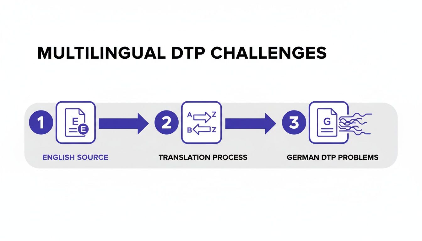
For instance, translating from English to German can easily make your text grow by up to 30%. That perfectly aligned paragraph in your English brochure? In the German version, it could suddenly spill out of its text box, creating a jumbled, unprofessional mess. On the flip side, some languages like Hebrew or Chinese often use fewer characters, which can leave behind awkward white space in a layout built for longer English sentences.
A layout that works perfectly in one language can become completely unusable in another. Multilingual DTP is the essential process of resizing, reflowing, and redesigning the document to accommodate these linguistic differences while preserving the original design's intent and clarity.
Technical and Cultural Complications
Beyond the length of the text, designers have to wrestle with a whole host of other complex issues.
- Script Direction: We take reading left-to-right for granted, but many languages don't work that way. Arabic, Hebrew, and Farsi are written right-to-left (RTL). This means the entire layout has to be mirrored. Images, charts, and even page navigation must be flipped to feel natural to an RTL reader.
- Character Sets and Fonts: Languages like Japanese or Russian rely on unique characters that need specific font support. If your original font can't handle them, the text might show up as little empty squares (often called "tofu"), making the document completely unreadable.
- Cultural Nuances: It's not just about words and characters. The images and symbols you use matter, too. A thumbs-up gesture might mean "great job" in the U.S., but it's a deeply offensive insult in parts of the Middle East. Colors, icons, and photos all need a cultural check.
Getting these projects right is non-negotiable for any company working in diverse markets. Europe accounts for nearly 49% of the global language services market, with North America following at 39.41%. That huge demand is fueled by Europe's incredible linguistic diversity and strict regulations that require documents to be available in multiple languages, a trend confirmed by research on the translation service market from StraitsResearch.com.
Ignoring these details can turn a beautifully crafted document into a communication disaster. This is especially true for complex files, which is why it's so critical to understand how to translate a PDF without wrecking its careful formatting. A process that respects the original layout is the only way to make sure your message hits the mark, no matter where in the world it's being read.
Anyone who has managed a multilingual project knows the classic DTP headache. The old way of doing things is a slow, frustrating cycle: translate the text first, then hand it off to a designer to manually fix all the formatting that inevitably breaks.
This back-and-forth isn't just inefficient; it's expensive. It introduces delays, inflates costs, and can easily lead to inconsistent branding from one language to the next. Thankfully, a much smarter approach is here, and it works by merging translation and design into a single, cohesive step.
The Rise of Format-Preserving Translation
Imagine a tool that doesn't just see words, but also understands the complete visual structure of your document—the headers, table layouts, fonts, and image placements. That’s the magic behind format-preserving translation.
Instead of ripping the text out and leaving the design behind, this technology translates the content within its original layout. This completely sidesteps the costly, manual rework that defined older methods. To get a sense of how these systems parse and reconstruct complex files, it's helpful to look into related fields like document processing automation.
The infographic below shows exactly why the old workflow is so problematic. A simple translation from English to German can cause text to expand, throwing the entire layout into disarray.

As you can see, the manual reformatting stage becomes a bottleneck, forcing projects to a halt while costs climb.
This shift couldn't come at a better time. The global language services industry was valued at USD 71.7 billion in 2024 and is expected to reach USD 75.7 billion in 2025. This growth is fueled by businesses needing to connect with customers around the world, making efficient translation more critical than ever.
By treating formatting as an integral part of the translation process, modern tools reduce turnaround times from weeks to hours and significantly cut localization budgets. The result is a faster, smarter, and more cost-effective way to achieve professional global communication.
This is especially true when dealing with complex documents. For professionals who constantly manage highly formatted files, finding the best PDF translator online that preserves the original design is no longer a luxury—it’s a necessity for maintaining brand integrity everywhere.
Still Have Questions About Desktop Publishing?
Even with a solid grasp of the basics, a few practical questions always seem to pop up. Let's tackle some of the most common ones to really solidify your understanding of DTP and its place in today's world.
Think of this as the "need-to-know" section that connects the theory to real-world practice.
Is DTP the Same as Graphic Design?
It’s a common mix-up, but no, they aren't the same thing. They are, however, very closely related partners in the same process. Graphic design is the creative, conceptual side of visual communication—it’s about dreaming up the logos, choosing the color palettes, and defining a brand's visual identity.
Desktop publishing, on the other hand, is the technical execution. A DTP specialist takes those creative assets and meticulously assembles them into a final, polished document ready for production.
A graphic designer might create a stunning visual concept for a magazine cover, but the DTP professional is the one who ensures every headline, image, and page number is perfectly aligned and ready for the printing press.
Here’s an analogy: a graphic designer is the architect who draws up the innovative blueprints for a building. The DTP specialist is the master builder who brings that vision to life, making sure every brick is laid and every window is perfectly placed.
Why Are Certain File Formats So Important for Printing?
When you’re sending a file to a professional printer, formats like PDF, AI, and EPS are the gold standard. You wouldn't use a web-centric format like a JPG or PNG for this, and the reason is all about preserving data integrity.
Professional print formats are designed to hold onto crucial information that others discard:
- Vector Data: This is essential. It allows logos, illustrations, and text to be scaled to any size—from a business card to a billboard—without a single pixel of quality loss.
- CMYK Color Profiles: Professional printers don't use the RGB (Red, Green, Blue) color you see on your screen. They use a four-ink process: Cyan, Magenta, Yellow, and Key (Black). Print-ready files contain this CMYK data to ensure the colors you see on paper match what you intended.
- Embedded Fonts: This is a lifesaver. Embedding fonts packs the font files right into the document, so the printer’s computer doesn’t have to guess and substitute a different one, which would throw off your entire design.
Handing a printer the wrong file type is a recipe for disaster. It almost always results in blurry images, wonky-looking text, or colors that are completely off.
Are DTP Skills Still Valuable Today?
Absolutely, and perhaps more than ever. While it's true that a lot of content lives online, the demand for beautifully formatted, professional documents hasn't gone anywhere. Think about all the reports, ebooks, technical manuals, product catalogs, and high-stakes marketing brochures out there. They all depend on solid DTP skills.
What's more, the core principles of DTP—understanding visual hierarchy, mastering typography, and creating a balanced layout—are universal design skills. The same expertise needed to lay out a perfect print brochure is directly applicable to designing a user-friendly website or a compelling digital presentation. These skills are incredibly versatile.
Stop wrestling with broken layouts and manual rework. DocuGlot uses AI to translate your documents while preserving the original formatting, delivering print-ready files in minutes, not weeks. Try DocuGlot today and see how easy global communication can be.
Tags
Ready to translate your documents?
DocuGlot uses advanced AI to translate your documents while preserving formatting perfectly.
Start Translating