What Is Desktop Publishing DTP A Guide to Professional Design
So, what exactly is Desktop Publishing? You’ve probably heard the term DTP, but what does it really mean? At its heart, it's the art and science of using specialized software to create visually stunning documents. It’s what separates a simple typed page from a professionally designed brochure, manual, or book ready for print or digital viewing.
What is Desktop Publishing (DTP)?
Think of it like this: a word processor like Microsoft Word or Google Docs is your digital notebook. It’s brilliant for getting your thoughts down, organizing text, and applying basic formatting. But when you need absolute command over how every single element looks and where it sits on the page, you need to trade that notebook for an artist's canvas. That canvas is desktop publishing software.
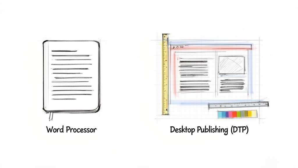
DTP software gives you that fine-grained control, letting you transform raw text and images into a polished, cohesive final product. It’s the bridge between raw content and professional design, making it possible to manage complex layouts that simple word processors just can't handle.
Instead of text just flowing from one line to the next, DTP lets you place every component—text boxes, images, charts, and captions—in a precise, intentional position on the page.
The DTP Revolution: A Quick History
Desktop publishing as we know it exploded onto the scene in the mid-1980s, offering a powerful and accessible alternative to the expensive, highly specialized typesetting equipment that dominated the industry. The real game-changer arrived in 1985 with the launch of the Apple LaserWriter printer and Aldus PageMaker software.
This potent combination put the power of professional page layout directly onto a personal computer. Suddenly, designers could create complex, print-ready documents from their desks, and the publishing world was never the same.
At its core, DTP is about communication design. It ensures that the visual presentation of information is as clear, compelling, and professional as the information itself.
What Makes DTP Different?
So, what really separates DTP from standard word processing? It all comes down to a few key capabilities that unlock total design freedom.
- Precise Layout Control: Define custom columns, set razor-thin margins, and make text flow beautifully around images with absolute accuracy.
- Advanced Typography: Go beyond bold and italic. DTP software gives you mastery over kerning (space between specific letter pairs), tracking (overall letter spacing), and leading (space between lines of text).
- Graphics Integration: Easily place, scale, crop, and layer vector and raster graphics right inside your document without breaking a sweat.
- Print-Ready Output: DTP tools are built from the ground up to prepare files for commercial printers, handling critical elements like CMYK color profiles, bleeds, and crop marks correctly every time.
Word Processing vs Desktop Publishing At a Glance
To make the distinction crystal clear, here’s a quick comparison of what each type of software is built for.
| Feature | Word Processing (e.g., MS Word, Google Docs) | Desktop Publishing (e.g., Adobe InDesign) |
|---|---|---|
| Primary Goal | Writing and editing text | Designing complex page layouts |
| Layout Control | Basic and linear; text flows automatically | Granular and frame-based; precise placement of every element |
| Typography | Limited font and spacing controls | Advanced control over kerning, tracking, leading, and typographic styles |
| Graphics Handling | Simple image insertion, often disrupting text flow | Seamless integration of graphics with sophisticated text-wrapping options |
| Color Management | Primarily uses RGB (for screens) | Built for professional printing with full CMYK and spot color support |
| Best For | Letters, reports, manuscripts, simple documents | Brochures, magazines, books, manuals, marketing materials |
This table highlights the fundamental difference: word processors are text-first, while DTP applications are design-first. Choosing the right tool depends entirely on whether your priority is the content itself or the final visual presentation.
From Physical Paste-Up to Digital Precision
To really get what desktop publishing (DTP) is all about, you have to look at the world it replaced. Before computers took over, laying out a magazine, brochure, or book was a hands-on, messy, and incredibly painstaking process. We're talking about a world of X-Acto knives, hot wax machines, and massive phototypesetting equipment that took up entire rooms.
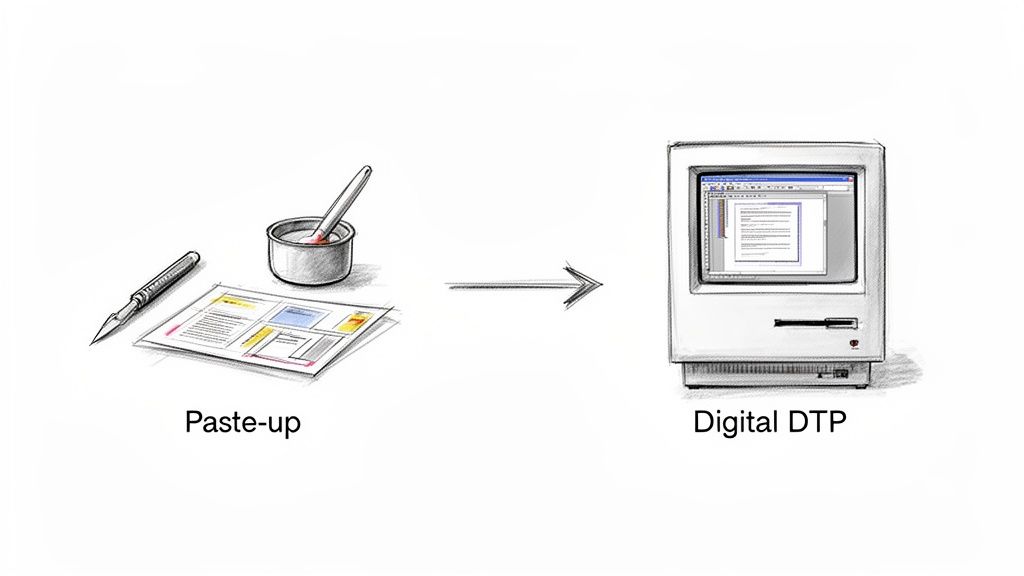
Designers would literally cut and paste—physically—columns of text and images onto large boards. Every single element had to be arranged by hand. This "paste-up" method was slow, very expensive, and demanded a specific set of skills and tools. As a result, professional publishing was a game only big companies with deep pockets could play. If you needed to make one tiny change? You often had to redo the whole board.
The Digital Shake-Up of 1985
Everything flipped on its head in the mid-1980s. A few key technologies came together and kicked off a massive change. The year 1985 is widely seen as the birth of DTP as we know it, all thanks to a perfect storm of tech that put the power of a professional print shop right onto a desktop computer.
This new setup blew the doors open for everyone, dismantling the old barriers that kept publishing an exclusive club.
The move from physical paste-up to a digital workflow wasn't just a simple tech upgrade. It fundamentally changed who could create and share professional-looking information with the world.
This game-changing combination was built on three essential pillars that formed the very first DTP workflow:
- The Apple Macintosh: This was huge. It gave designers a computer they could actually use, with a graphical interface (GUI) that showed them what the page would look like on screen. This was the birth of WYSIWYG—"What You See Is What You Get."
- Adobe PostScript: Think of this as the universal translator between the computer and the printer. This page description language made sure the complex designs created on screen could be printed exactly as intended, with sharp text and graphics.
- Aldus PageMaker: This was the glue that held it all together. As the first major DTP application, PageMaker let users pull in text and images and arrange them visually on a digital page, giving them precise control over the final look.
Lasting Principles in Modern Design
This trio of hardware, software, and a common printing language didn't just speed up an old process; it invented a completely new one. All of a sudden, small businesses, freelancers, and even schools could create materials that looked every bit as professional as something from a major publisher.
The core ideas born in that era—using frames for layouts, having fine-tuned control over typography, and blending text and graphics seamlessly—are still the bedrock of today's powerful design tools like Adobe InDesign. That journey from a physical cutting board to digital precision changed design and communication for good.
Exploring The Core DTP Software Toolkit
With a sense of where DTP came from, let’s look at the actual tools designers use today. At the heart of any desktop publishing project isn’t just one piece of software, but a whole ecosystem of applications that work together. Think of it less like a single magic wand and more like a professional workshop, with specialized stations for each part of the creative process.
This toolkit really stands on three distinct pillars. A seasoned pro knows how to move between these tools seamlessly, often within the same project, to build one polished, final document. Getting good at DTP means knowing exactly which tool to grab for the job at hand.
The Three Pillars of DTP Software
The modern DTP workflow is built around a trio of software types, each with its own superpower. Understanding what each one does best is the key to getting professional results.
Page Layout Applications (The Assembler): This is mission control. Software like Adobe InDesign is where all the individual pieces—text, images, graphics—are brought together. It’s here that you build the blueprint for your document, whether it’s a simple one-page flyer or a massive, multi-chapter book. Its real strength lies in managing complex layouts with pinpoint precision.
Vector Graphics Editors (The Illustrator): Need a logo, an icon, or a technical illustration that has to stay sharp at any size? That's a job for a vector editor like Adobe Illustrator. These tools use mathematical formulas to create lines, curves, and shapes, which means you can scale a graphic from the size of a postage stamp to a billboard without it ever getting blurry.
Raster Image Editors (The Photo Lab): When you're working with anything made of pixels, like a photograph, you need a raster editor. Adobe Photoshop is the undisputed king here. It’s the digital darkroom for retouching photos, correcting colors, and creating stunning, pixel-perfect imagery. It gives you microscopic control over every dot in a photo.
Understanding Key File Formats
The software is only half the story; the file formats you use are just as crucial. Picking the right format ensures your design looks exactly how you planned it, whether it’s on a screen or hot off a commercial press.
INDD (InDesign Document): This is the master blueprint. As the native project file for Adobe InDesign, it holds all your layout instructions, text, and links to your images and graphics. This is the file you edit and refine.
EPS (Encapsulated PostScript): An older vector format that's still incredibly useful. You'll often see logos and illustrations saved as EPS files because they can be dropped into page layout software without losing their crisp, scalable quality.
PDF (Portable Document Format): This is the universal standard for the finished product. A PDF bundles everything—fonts, images, layout—into one self-contained package. It guarantees your document will look the same on anyone's computer and print correctly every time.
Of course, DTP is more than just placing elements on a page. The software gives you deep control over things like typography. You can get a better sense of how much this matters by exploring the role of typography in crafting professional documents.
Here’s a quick peek inside Adobe InDesign, the central hub where most DTP projects come to life.
Look at how it's all laid out: toolbars on the side, panels for managing pages and layers, and the main document right in the middle. Everything is designed to give a designer complete and precise control over every single element on the page.
A Practical Look at the DTP Workflow
Knowing the tools is one thing, but understanding how they fit into a repeatable process is what really makes desktop publishing click. A professional DTP project isn't a random burst of creativity; it's a carefully planned journey from a rough concept to a polished final document. Think of this workflow as a blueprint that ensures every piece of the puzzle fits perfectly.
Most DTP projects, big or small, move through a five-stage lifecycle. Breaking the work down into these distinct steps is how designers maintain control, keep quality high, and ensure consistency from the first page to the last.
The diagram below gives you a great visual of how different assets, like vector art and photos, are created separately before flowing into the final layout stage.
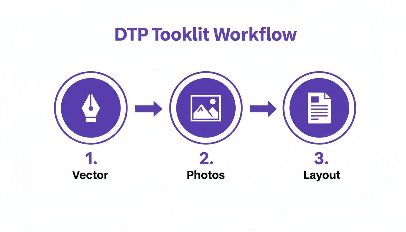
This really highlights how DTP is an assembly process. You're bringing together all these different, pre-made ingredients into your page layout software to create the final dish.
The Five Core Stages of a DTP Project
So, let's walk through the key phases that turn an idea into a professional document. Each stage builds on the one before it, creating a logical and efficient path to a finished product.
Content Creation and Gathering: This is where it all starts. Before a single pixel is placed, all the written content—the copy—needs to be written, edited, and approved. Getting the text finalized upfront saves a world of headaches later, preventing major layout revisions that can throw a project off track.
Image Sourcing and Preparation: At the same time, the visual elements are gathered. This might mean finding high-resolution stock photos, creating custom illustrations in a vector program, or collecting company logos and icons. These images are then tweaked, color-corrected, and resized to fit the project's needs.
Page Layout and Design: With the words and pictures in hand, the designer fires up their page layout software (like Adobe InDesign). This is where the document's skeleton is built—setting up grids, defining margins, and placing the text and image frames onto the page. The entire visual identity of the document comes to life here.
Typography and Formatting: Now it's time to sweat the details. The designer dives deep into styling the text, applying paragraph and character styles to ensure consistency. They'll meticulously adjust spacing between letters (kerning and tracking) to make everything easy to read. This phase is what separates an amateur-looking document from a truly professional one.
Prepress and Export: The final step is all about preparing the file for its destination. If it's going to a commercial printer, this means running preflight checks for errors, adding bleed and crop marks, and exporting a print-ready PDF. For digital distribution, the focus shifts to optimizing file size and maybe adding interactive elements.
A structured workflow like this becomes absolutely critical for more complex projects. Imagine creating a user manual in five different languages. A solid DTP process is the only way to manage all those versions without the design falling apart. You can see just how intricate this gets by exploring professional document translation services.
As part of this final quality check, it's also becoming standard practice to ensure documents are inclusive. This means focusing on things like creating accessible PDFs so that the document is not only beautiful but also usable by the widest possible audience.
Why DTP Is A Game-Changer For Multilingual Projects
When you’re taking content global, desktop publishing goes from being a design nice-to-have to a business-critical need. Let’s be clear: just translating the words in a document is only half the job. Without skilled DTP work, that polished layout you spent weeks perfecting in English will likely turn into an unreadable mess in German, Japanese, or Arabic.
This breakdown happens because languages just don't behave the same way. The words themselves, their sentence structure, and even the direction they’re read can vary wildly. A simple copy-and-paste of translated text just can’t account for these deep-seated differences, and that's where the design problems begin.
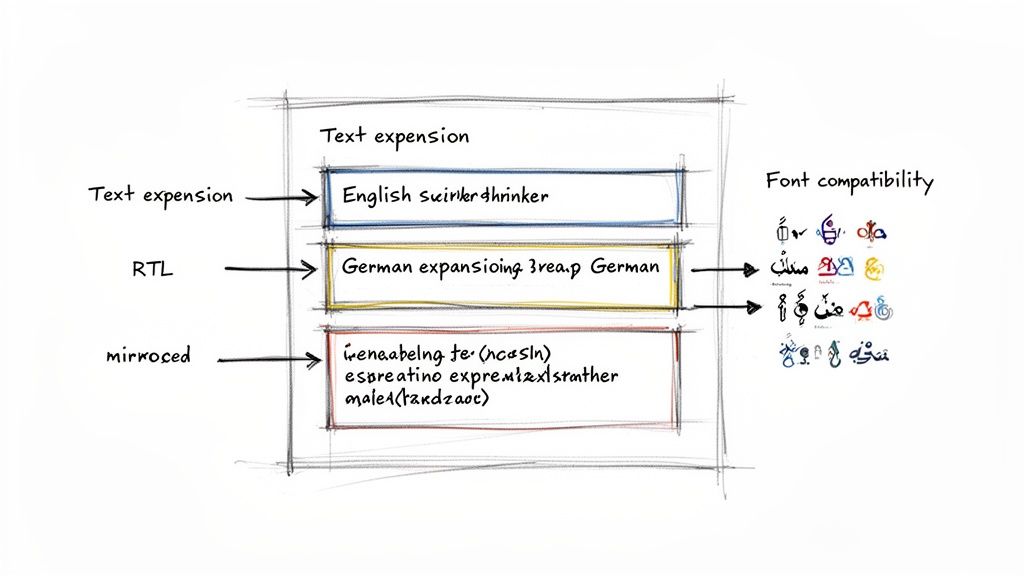
The Problem of Text Growing and Shrinking
One of the first and most common headaches in any multilingual project is text expansion. Think about translating from a compact language like English into a wordier one like German or Spanish. The translated text can easily swell by up to 30%.
That extra text has to go somewhere. It spills out of text boxes, shatters carefully aligned columns, and can shove key images right off the page. The opposite happens, too. Text contraction, which often occurs when translating into languages like Chinese or Japanese, can leave behind distracting gaps of white space, making your design feel unbalanced and empty.
Without a DTP specialist stepping in to manually resize every single text frame, table cell, and headline, the translated document isn't just ugly—it's often unusable. This kind of oversight reflects poorly on a brand's commitment to quality.
This manual fix-it job is a huge drain on time and money. For every single file, a designer has to go back to the drawing board, painstakingly tweaking hundreds of elements and essentially redesigning the document just to make the new text fit.
Dealing with Tricky Layouts and Font Nightmares
Beyond just the length of the text, a whole host of other localization issues demand an expert DTP touch. If you ignore them, you risk breaking your document’s professional look and feel entirely.
Here's a look at some of the most common DTP challenges that come up when translating documents and the old-school manual labor they usually require.
Common DTP Challenges In Document Translation
| Challenge | Description | Typical Manual Solution |
|---|---|---|
| Right-to-Left (RTL) Scripts | Languages like Arabic, Hebrew, and Farsi are read from right to left. This requires a complete reversal of the page layout, including images, charts, and navigation. | A designer must manually flip every layout element, re-align columns, and adjust master pages to match the new flow. |
| Font Incompatibility | A font that works for English may not contain the special characters needed for Russian (Cyrillic), Thai, or Vietnamese. This results in broken text or "tofu" (☐☐☐). | A DTP specialist has to find and replace all incompatible fonts with ones that support the target language's script. |
| Line & Page Breaks | Changes in word length and sentence structure can cause awkward line breaks or push single words onto a new page, creating "widows" and "orphans" that look unprofessional. | Hours are spent manually adjusting tracking, kerning, and hyphenation settings to fix poor text flow throughout the doc. |
| Cultural Adaptation | Images, icons, or color schemes that are perfectly fine in one culture might be inappropriate or even offensive in another. | The designer must source and replace culturally insensitive visuals and update the color palette as needed. |
As you can see, the manual effort involved is significant. Each of these challenges can completely derail a project if not handled correctly from the start.
This is exactly why traditional translation workflows become so cumbersome. Manually fixing these problems in a single brochure is a chore. Now, imagine doing it for a 50-page technical manual that needs to go out in ten different languages. The work—and the cost—balloons with every new version.
If you’re interested in a deeper look at these hurdles, guides on how to translate a PDF while preserving its layout can offer more context. It's in this high-stakes environment where modern, automated solutions are truly changing the game.
The Future of DTP Is Automated
The days of painstakingly nudging text boxes and manually fixing translated documents are numbered. We're seeing a fundamental shift in the industry, driven by smart technology and AI, that automates the most frustrating parts of the multilingual DTP workflow. Problems like text expansion, layout breaks, and font mismatches are finally being tackled head-on.
At the heart of this change is a concept called format-preserving translation. Think about it: what if you could upload a complex InDesign file or a meticulously designed PDF and get back a translated version with every single design element perfectly in place? That’s the promise, and it's already a reality.
Instead of a designer manually resizing every single frame to fit a longer German phrase, this new breed of technology intelligently reflows the content and adjusts the layout on its own. It's a game-changer.
How Format-Preserving Translation Works
So, how does it pull this off? The system doesn't just see the words; it analyzes the document's entire underlying structure. It understands the relationships between headers, columns, images, and tables.
When the translation comes in, the software uses algorithms to adjust all those elements to fit the new content, all while honoring the original design rules.
The knock-on effects are massive:
- Speed: A DTP job that used to take a designer days of tedious manual work can now be done in minutes or hours.
- Cost Savings: The less manual design time you need, the more you save. The cost reduction in multilingual DTP can be dramatic.
- Accessibility: Suddenly, creating professional-grade, multilingual documents isn't just for massive corporations with huge budgets.
By preserving the original layout, automated systems ensure brand consistency across all languages. The translated documents look and feel exactly like the source material, maintaining a professional and cohesive brand image globally.
This technology makes getting documents ready for a global audience far more efficient. To really grasp how it works in the real world, it's worth checking out modern document translation software that has this functionality built right in.
Ultimately, automation frees up designers to do what they do best—be creative—instead of getting bogged down in repetitive, corrective work. It elegantly bridges the gap between raw translation and a polished final product, making the whole process of global DTP smarter and faster.
Common Questions About DTP, Answered
Let's clear up some of the usual questions that come up when people talk about desktop publishing. These quick answers should give you a better sense of where DTP fits into the picture today.
Is DTP Still Relevant in 2024?
Absolutely. You might think everything is web-based now, but DTP is the backbone for anything that needs a fixed, polished layout. We're talking about materials meant for print or for distribution as a static digital file.
This covers everything from physical books, product packaging, and trade show banners to professional PDFs like annual reports, ebooks, and technical manuals. Whenever the visual layout has to be perfect and consistent no matter who opens it, DTP is what gets the job done.
What’s the Difference Between DTP and Graphic Design?
It's a great question, as the two often work hand-in-hand. Think of it this way: graphic design is the creative art of visual communication. It’s about creating the core visual identity—the logos, the color schemes, the brand style.
Desktop publishing, on the other hand, is the technical craft of assembling those visual elements and text into a final, structured document. A graphic designer might create a stunning set of icons and choose the perfect fonts, but it’s the DTP specialist who arranges them meticulously on the page in software like Adobe InDesign.
In short, graphic design creates the ingredients; desktop publishing follows the recipe to bake the cake. Most high-stakes projects need both to look professional.
Can’t I Just Use Microsoft Word for DTP?
While you can get surprisingly far with Microsoft Word, it's not built for the precision that professional DTP demands. For a simple flyer or an internal memo, it's fine. But it starts to fall apart when you need pixel-perfect control over complex layouts.
Word often struggles with precise image placement, sophisticated typography, and the technical specs required for commercial printing (like CMYK color modes or bleed settings). Using it for a professionally printed brochure is like trying to build a cabinet with only a screwdriver—you're missing the specialized tools needed for a high-quality finish.
Tired of your translated documents losing their professional look? DocuGlot uses AI to translate your files while keeping every table, header, and style perfectly intact. Preserve your formatting and translate documents in minutes.
Tags
Ready to translate your documents?
DocuGlot uses advanced AI to translate your documents while preserving formatting perfectly.
Start Translating